Women experiencing fertility challenges are not met with resources that cater
to BIPOC specific needs and don't resonate with them culturally.
to BIPOC specific needs and don't resonate with them culturally.


.png)
Our capstone course in my final term of undergrad challenged us to create a digital solution to bridge the gender disparity and help improve women's mental health. Given that Canada is a multicultural country welcoming immigrants from different backgrounds, our group of five chose to address how we can improve BIPOC (Black, Indigenous, People of Colour) women's experiences navigating their fertility journeys. We partnered with Sun Life to research, develop, and pitch an interactive prototype aimed at securing better long-term outcomes for women's mental health, ultimately helping to reduce overall insurance claim costs.
For this project, I conducted informal interviews with BIPOC women who have experienced fertility struggles, designed and modified low-and high-fidelity prototype screens, conducted usability tests, and created graphical assets for branding used throughout the product.
Figma
FigJam
UX/UI Designer
UX Researcher
January - April
(4 months)
1 Project Manager
2 Business Analysts
2 UX/UI Designers
Access to personalized and culturally relevant fertility resources is crucial for all women facing challenges in this area. We conducted interviews with three BIPOC women who have experienced complications throughout their fertility journeys. Unfortunately, due to the sensitive nature of the topic and the Capstone research collection guidelines, we were only able to interview a limited number of individuals. From these interviews, we concluded that there is significant stigma surrounding infertility, and many women found it challenging to open up about their experiences.
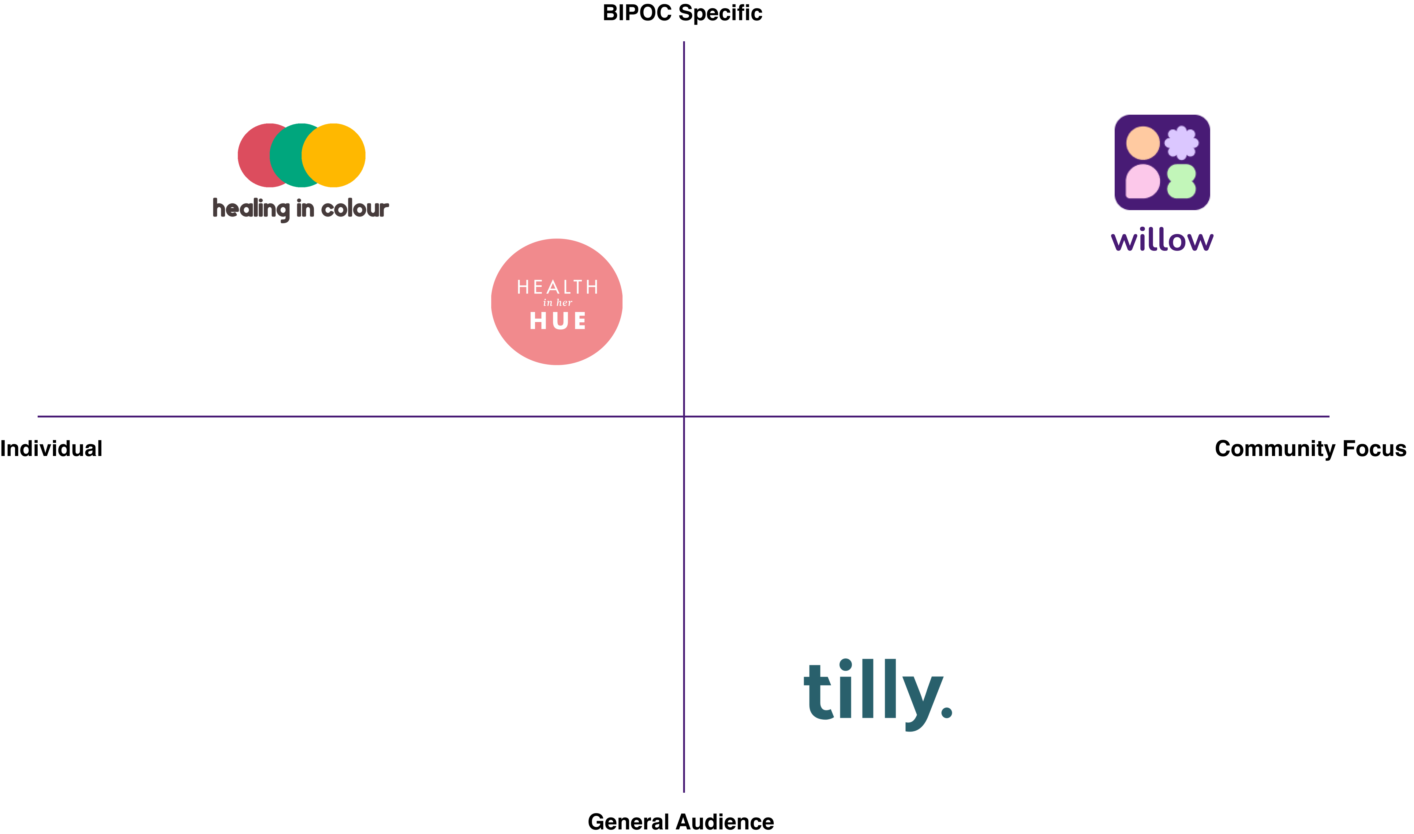
We conducted a competitive analysis of popular women's reproductive and mental health applications available on the market to better understand the gaps that exist. Healing in Colour, Health in Her HUE, and Tilly were explored and analyzed to see if their features addressed pain points from our user interviews. We discovered that many existing applications had little to no community focus, did not cater to a diverse range of cultures and backgrounds, and had minimal emphasis on fertility.
Culturally relevant and supportive resources are crucial for the physical and mental well being of BIPOC women navigating fertility challenges. However current resources on the market fail to address their specific needs. After conducting thorough research about disparities affecting ethnic and racial minorities, it is evident that addressing the issue of continuing stigma and intergenerational effects (in the context of fertility treatment in North America) is crucial. This insight allowed us to group our findings into the main pain points our users experience.
Based on all our findings, we developed a persona of who would represent the user group for our solution:

From all our findings, we complied a list of requirements we determined would make the largest impact for our most viable prototype.
The initial design of our product was inspired by similar existing solutions on the market. Our primary goal was to enhance communication and engagement within groups, as well as to help users discover relevant resources. As one of two UX/UI designers, my teammate and I began by sketching some potential ideas in Procreate, which we later refined in Figma.
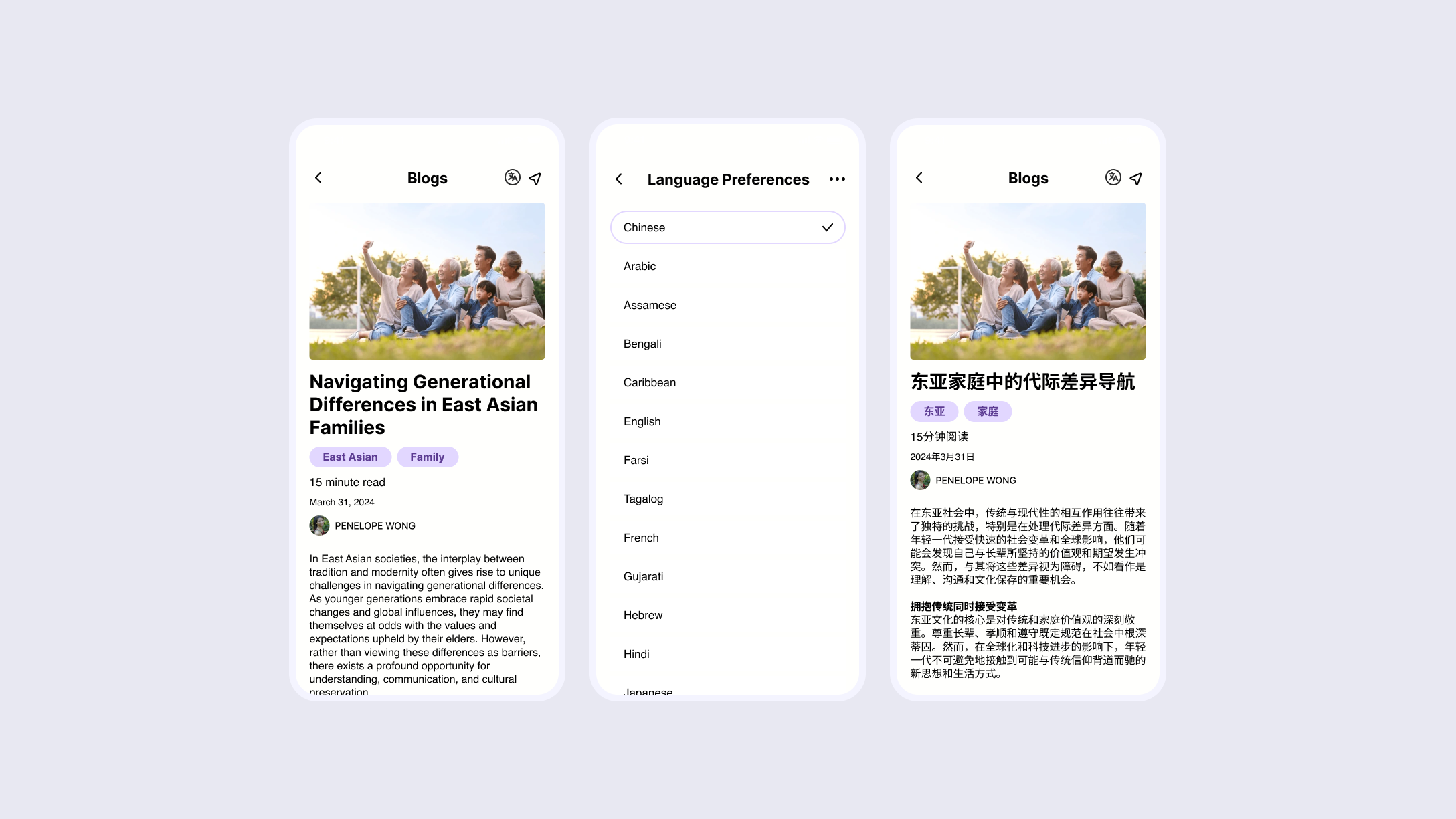
We explored various ways to deliver resources, groups, and therapy to our users. During this phase, we experimented with different types of media, creating prototype screens that supported video, blogs, and forums. We also included a potential journaling feature in our low-fidelity prototype to help users reflect on their emotions throughout their fertility journey, with the goal of fostering self-acceptance and emotional stability.
.png)
With a basic functional prototype completed, we tested our design through usability tests. The feedback we received helped us improve the product and better tailor it to our target audience.
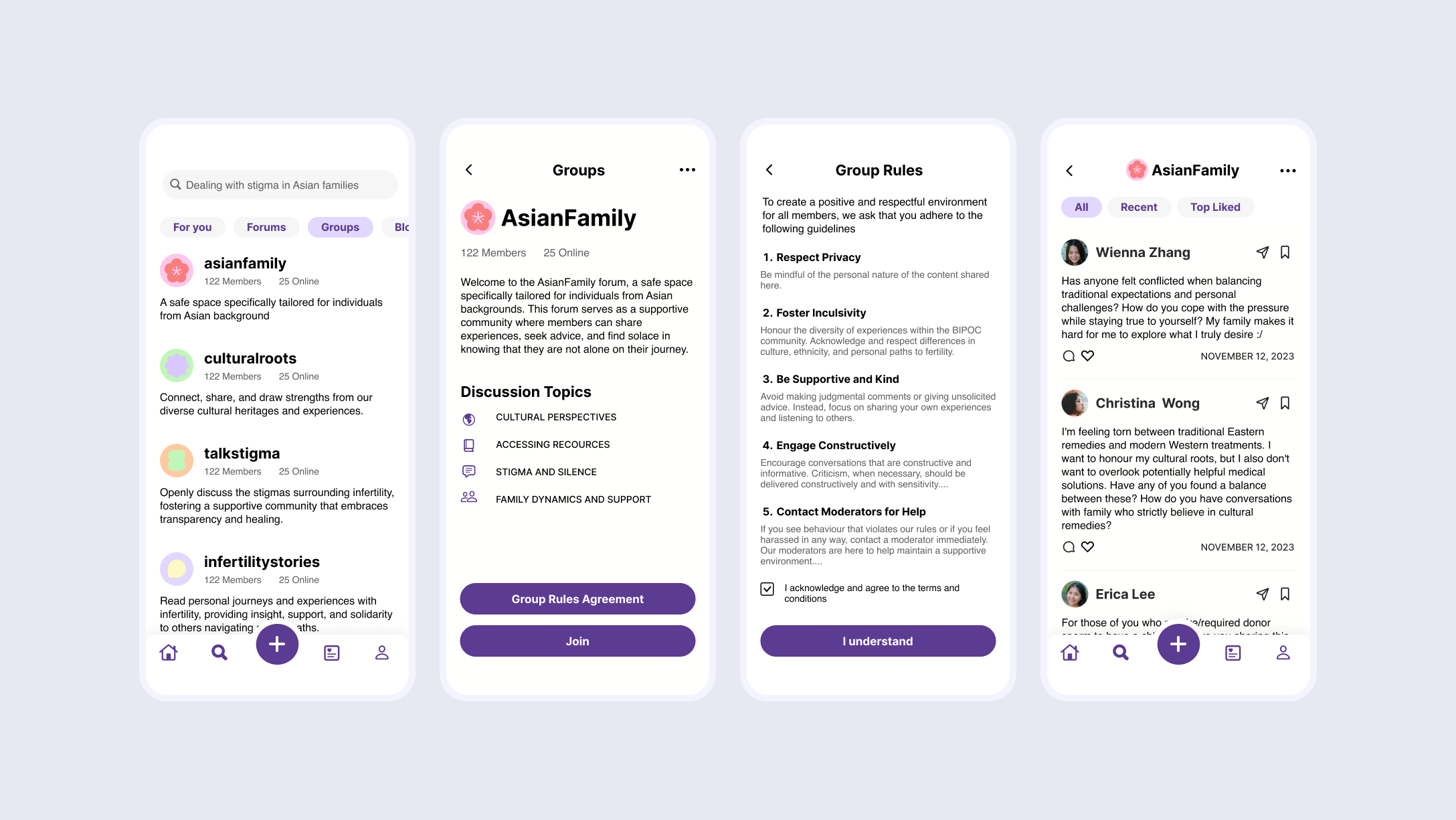
With an overload of main features in our MVP prototype, we decided to remove the 'Growth Tracking' feature. While it was beneficial for self-reflection, we realized it didn't fully align with our focus on communication and community engagement. Instead, we chose to expand on the 'Invite' feature by adding a 'Family Board,' which allows for easy communication between invited family members on the app. Both parties can pin resources (forums and blogs) visible to all board members. This helps to bridge the generational divide between family members and help everyone get on the same page. Users can easily switch between their community board (with resources from groups and people they follow) and their family board, keeping the two spaces distinct.
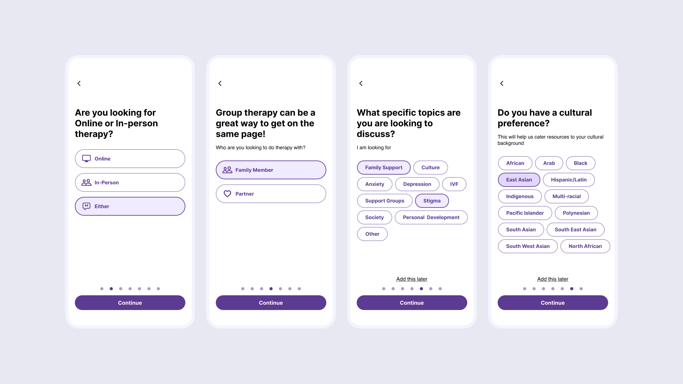
Furthermore, the onboarding process was restructured to provide more information about Willow's mission and its focus on supporting the BIPOC community with fertility resources. The therapy quiz was updated to include questions about the user’s language and culture, ensuring they are matched with culturally relevant therapists. Additionally, we moved the 'Invite' button out of the settings menu after testers reported difficulty finding it.
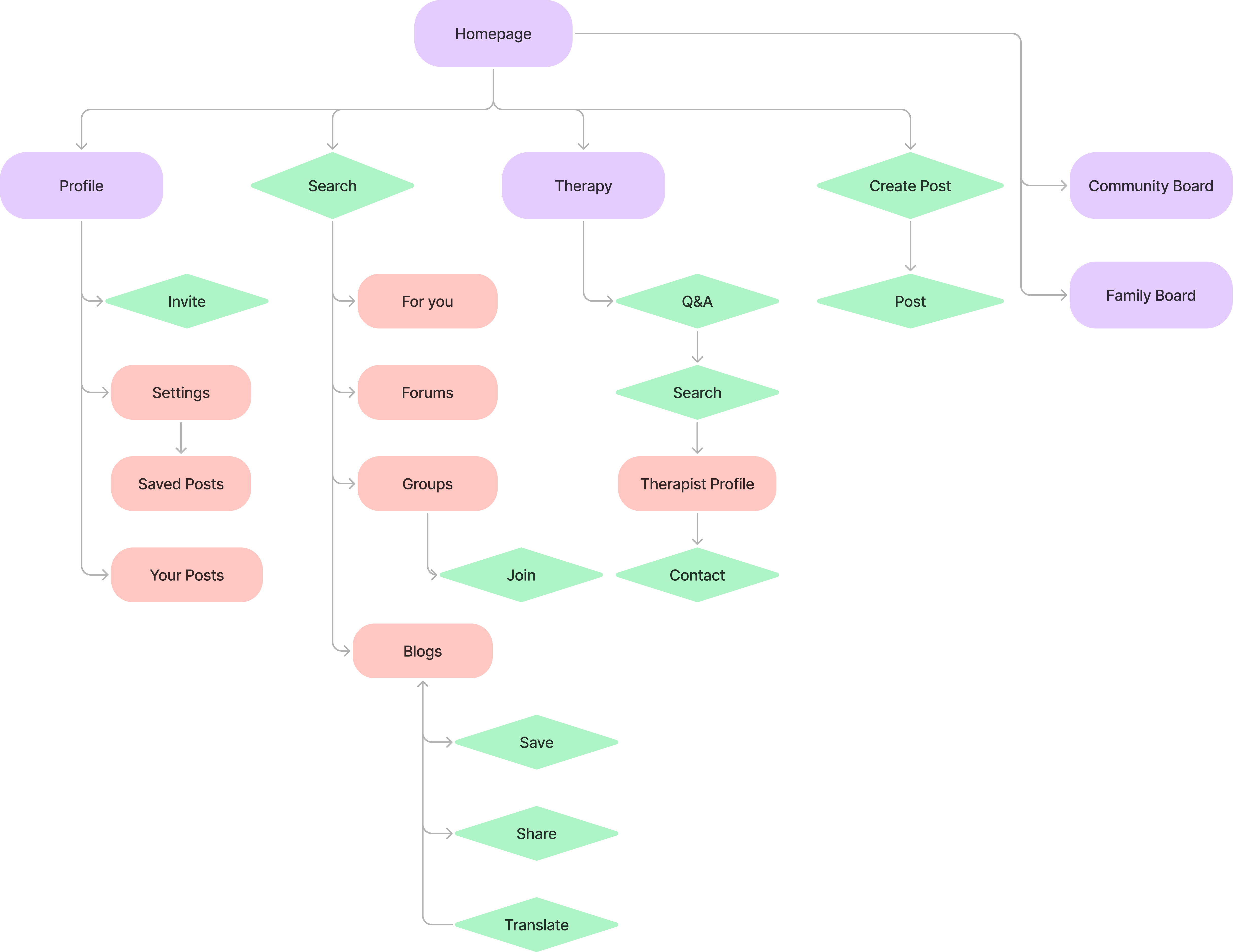
After updating our information architecture as well as features, my teammate and I went on to rework our low fidelity prototype with the improved changes.
.png)
Once we’ve revised and established our features we made changes reflecting the feedback received. From there, we were confident to take our low-fidelity wireframes into a more polished final version.
.png)
The image above shows both the low-fidelity and final versions of the navigation bar in our product. To promote community engagement, we emphasized the 'New Post' button, making it stand out amongst the other icons. Additionally, we moved the search icon from the homepage to the navigation bar to give users quicker access to resources and topics they may want to search.
A final usability test was conducted, this time focusing on the overall look, feel, and flow of the app. After collecting the feedback, my teammate and I worked on implementing the necessary changes.
.png)

Here are a few graphics I created for the onboarding screens in our prototype. When developing the initial concepts for the visual elements, we aimed to strike a balance between maturity and lightheartedness, hoping to ease the transition into a sensitive topic. The simplicity and ambiguity of the shapes also made them versatile and easy to integrate across various design elements.
.png)
.png)
.png)
.png)
After our final round of testing and tweaks, we were ready to present our product, you can take a look here:
.png)